

Hey Everyone!!!
My name is Atharva and I am an engineering student who is passionate about programming, content writing and open-source. I am curious about the world of technology and how it can be used to make a difference in the world.
In this blog, I will be explaining how to create a simple YouTube Page Clone using HTML and CSS only!!!
Let's Begin !!!

Setting Up the HTML Structure
To start our YouTube page clone, we first create the basic HTML structure. We've included some essential meta tags for character encoding and viewport settings. Additionally, we've linked to the Google Fonts API to style our page with the "Roboto" font. We also link to separate CSS files for our header, video section, and sidebar.
<!DOCTYPE html>
<html lang="en">
<head>
    <meta charset="UTF-8" />
    <meta name="viewport" content="width=device-width, initial-scale=1.0" />
    <link rel="preconnect" href="https://fonts.googleapis.com" />
    <link rel="preconnect" href="https://fonts.gstatic.com" crossorigin />
    <link href="https://fonts.googleapis.com/css2?family=Roboto:wght@400;500;700&display=swap" rel="stylesheet" />
    <link rel="stylesheet" href="styles/header.css" />
    <link rel="stylesheet" href="styles/video.css" />
    <link rel="stylesheet" href="styles/sidebar.css" />
    <title>YouTube Clone</title>
</head>
<body>
<!-- Header and Sidebar Content Goes Here -->
</body>
</html>
Now, let's dive into the HTML and CSS for the Header Section and the Sidebar.
Header Section

The Header Section is the top part of the YouTube page, containing the YouTube logo, search bar, and user-related icons. Below is the HTML code and an explanation of the essential elements:
<header class="header">
    <div class="left-section">
        <img class="hamburger-menu" src="icons/hamburger-menu.svg" />
        <img class="youtube-logo" src="icons/youtube-logo.svg" />
    </div>
    <div class="middle-section">
        <!-- Search Bar and Buttons Go Here -->
    </div>
    <div class="right-section">
        <!-- User Icons Go Here -->
    </div>
</header>
Left Section
In the left section, we have the hamburger menu and the YouTube logo. These are aligned using display: flex and align-items: center.
Middle Section
The middle section contains the search bar and buttons. We use display: flex and align-items: center to align them properly.
Search Bar
The search bar input has various styles applied, including borders, padding, and font size. Additionally, we've added a placeholder text style to make it more user-friendly.
Buttons with Tooltips
The search and voice search buttons, as well as the upload icon, have tooltips that appear on hover. These tooltips are styled with background colors, font sizes, and positioned relative to their parent elements.
Right Section
The right section consists of icons for upload, YouTube apps, notifications, and the user's profile picture. These icons are properly aligned and styled.
Sidebar Section
The Sidebar Section is fixed on the left side of the page and contains navigation links. Let's explore the HTML and CSS for the sidebar:
<nav class="sidebar">
    <div class="sidebar-link">
        <img src="icons/home.svg" />
        <div>Home</div>
    </div>
    <!-- More Sidebar Links Go Here -->
</nav>
In the sidebar, each link is a flex container with both an image and text. On hover, the links change background colors to provide a visual indication of interactivity.
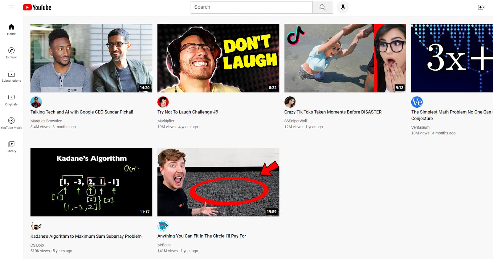
Designing the Main Video Section
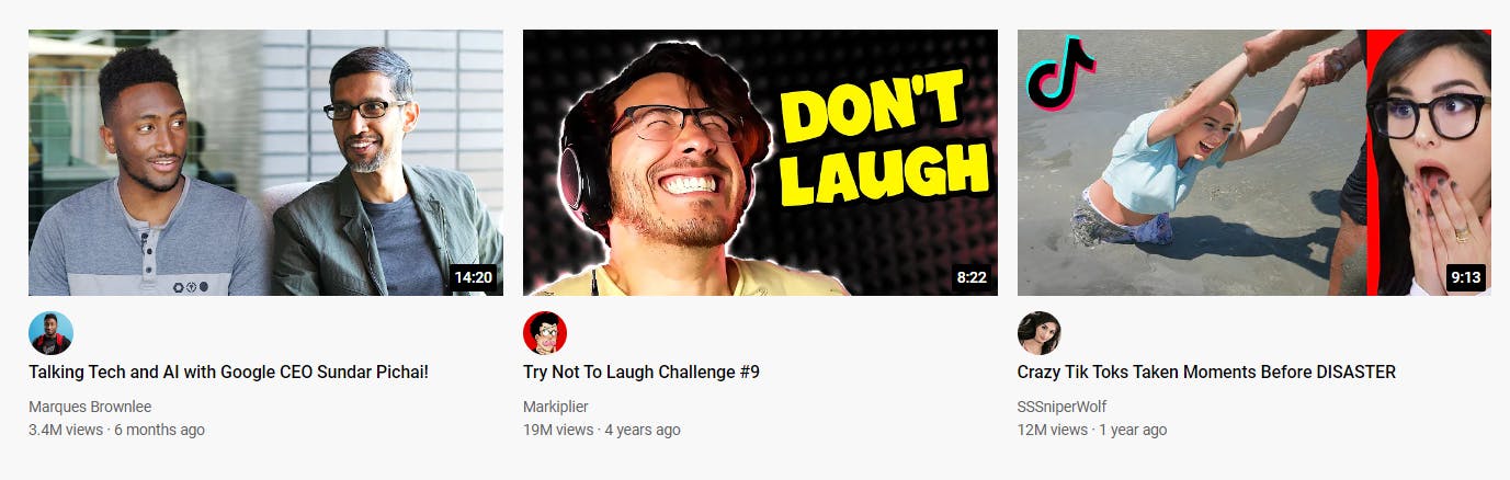
In this section, we'll go over the HTML and CSS for the main video section of our YouTube page clone. This section showcases video previews and important video information.
HTML Structure
Here is the HTML structure for the main video section:
<main>
<section class="video-grid">
<div class="video-preview">
<!-- Thumbnail and Video Time -->
<div class="thumbnail-row">
<img class="thumbnail" src="thumbnails/thumbnail-1.webp" />
<div class="video-time">14:20</div>
</div>
<!-- Channel Picture and Video Information -->
<div class="video-info-grid">
<div class="channel-picture">
<img class="profile-picture" src="channel-pictures/channel-1.jpeg" />
</div>
<div class="video-info">
<p class="video-title">Talking Tech and AI with Google CEO Sundar Pichai!</p>
<p class="video-author">Marques Brownlee</p>
<p class="video-stats">3.4M views · 6 months ago</p>
</div>
</div>
</div>
<!-- More Video Previews Go Here -->
</section>
</main>
HTML Explanation:
<main>: This tag defines the main content section of the web page.<section class="video-grid">: It represents a section that contains video previews.<div class="video-preview">: Each video preview is contained within thisdiv. It includes a thumbnail, video time, channel picture, and video information.<div class="thumbnail-row">: Thisdivhouses the thumbnail image and the video time.<img class="thumbnail" src="thumbnails/thumbnail-1.webp" />: This image tag displays the video thumbnail.<div class="video-time">14:20</div>: It shows the duration of the video.<div class="video-info-grid">: Thisdivuses a grid layout to align the channel picture and video information.<div class="channel-picture">: It contains the channel's profile picture.<img class="profile-picture" src="channel-pictures/channel-1.jpeg" />: This image displays the channel's profile picture.<div class="video-info">: Thisdivholds the video title, author, and video statistics.<p class="video-title">Talking Tech and AI with Google CEO Sundar Pichai!</p>: It displays the title of the video.<p class="video-author">Marques Brownlee</p>: This paragraph shows the video author's name.<p class="video-stats">3.4M views · 6 months ago</p>: It presents video statistics, including view count and upload date.
CSS Styling
The CSS styles applied to the main video section are as follows:
.thumbnail {
  width: 100%;
}

.video-title {
  font-size: 14px;
  font-weight: 500;
  line-height: 20px;
  margin-bottom: 10px;
}

.video-info-grid {
  display: grid;
  grid-template-columns: 50px 1fr;
}

.profile-picture {
  width: 36px;
  border-radius: 50px;
}

.thumbnail-row {
  margin-bottom: 8px;
  position: relative;
}

.video-author, .video-stats {
  font-size: 12px;
  color: rgb(96, 96, 96);
}

.video-author {
  margin-bottom: 4px;
}
CSS Explanation:
.thumbnail: Sets the width of video thumbnails to 100%, ensuring they stretch to the full container width..video-title: Styles the video titles with a font size of 14px, a font weight of 500, and a line height of 20px. It also adds margin at the bottom for spacing..video-info-grid: Utilizes a grid layout for the channel picture and video information. It consists of two columns: a 50px-wide column for the channel picture and a flexible column for video information..profile-picture: Styles the channel profile pictures, setting a width of 36px and a circular border..thumbnail-row: Manages the spacing and relative positioning of the video thumbnails. It adds a margin at the bottom and contains the video time..video-authorand.video-stats: Style the video author and statistics text. They have a font size of 12px and a color of gray (rgb(96, 96, 96)). Additionally,.video-authorhas a margin at the bottom for spacing.
Media Queries for Responsiveness
To ensure your YouTube page clone looks great on various screen sizes, media queries are applied:
@media (max-width: 750px) {
  .video-grid {
    grid-template-columns: 1fr 1fr;
  }
}

@media (min-width: 751px) and (max-width: 999px) {
  .video-grid {
    grid-template-columns: 1fr 1fr 1fr;
  }
}

@media (min-width: 1000px) {
  .video-grid {
    grid-template-columns: 1fr 1fr 1fr 1fr;
  }
}
Media Queries Explanation:
(max-width: 750px): Adjusts the grid layout to two columns for smaller screens, making the layout responsive.(min-width: 751px) and (max-width: 999px): Maintains a three-column grid for medium-sized screens to enhance the viewing experience.(min-width: 1000px): Expands the grid to four columns for larger screens, optimizing content distribution.
With these styles and media queries, your YouTube page clone will adapt smoothly to different devices and screen sizes, providing a consistent and enjoyable user experience.

Conclusion
In this blog, we've covered the HTML and CSS code for the Header Section, Sidebar Section and Main Section of our YouTube page clone. You can use this to make clones of different websites using the semantics above.
Credits:
The project is from SuperSimpleDev's YouTube Channel which I have learnt and modified from!

Liked This Blog?
Do react and comment with your thoughts on the points discussed above.
Make sure to follow me :